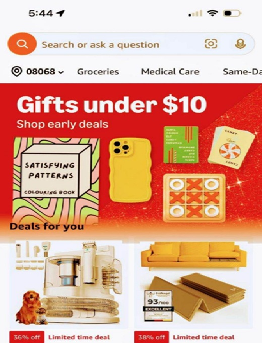
Our vision changes in subtle ways, and one of the most overlooked aspects is the yellowing of the corneas. This natural process causes the world to appear with a slightly yellow tint, making it harder to distinguish between certain colors, especially when packaging designs don’t provide enough contrast.Ever heard of the filter "Sepia?"
So what does this mean for our Amazon images & content?
Imagine your buyer is 71-year old Susan. She's trying to read a label on a product. The text is light gray on a white background, or maybe soft pink on beige. For someone with aging eyes, especially with the corneal yellowing effect, these colors blur together.
Here’s a concrete example:
Susan walks into a pharmacy and picks up a moisturizing cream. The packaging uses pastel yellow text on a pale white label. What Susan sees:
Text that’s nearly invisible because the colors blend too much
Difficulty reading important information like ingredients or usage instructions
Frustration trying to differentiate between multiple products on the shelf
It’s an all-around poor experience, one that makes you more likely to put the product back and search for something easier to read
Images of your product online that have these issues will equally alienate all of the "Susans" in the world
To avoid this problem, brands should focus on:
High-contrast colors: Use dark fonts on light backgrounds (and vice versa)
Avoiding light text on light backgrounds: This might look sleek, but it’s ineffective for aging eyes
Larger, bolder fonts: Especially for key information like product names, directions, and warnings
Clear separation between text and background elements: Simple, bold designs that stand out (we heard a lot of this kind of image optimization spoken about at Amazon Accelerate this year)
Designing for older consumers isn’t just about being accessible. It’s about providing a better buying experience for a growing part of the population.
If they struggle to read it, they’re not buying it.
Get the next issue
The free weekly newsletter Rob and I write for Amazon sellers.